Kevin Drum Is An Innumerate Hack
Kevin Drum don’t grok numbers. I think we all knew that. But occasionally he goes so far over the edge that it calls for correction, and today’s one of those days.
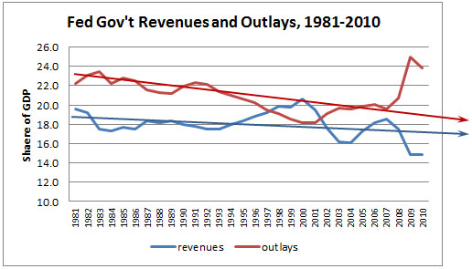
Kevin has taken a handy chart (originally here), and drawn some trendlines onto it to proclaim that we don’t have a spending problem at all:
I’ve added some handy lines to show the general trajectory of spending and taxes over the past three decades. Putting aside the Great Recession, which has temporarily cratered revenues and imposed a burst of stimulus spending, the trend is clear: spending has generally gone down, but so have taxes. Future healthcare expenses are a big issue, but the current deficit just hasn’t been primarily a spending problem. It’s been a tax cut problem.
So let’s start at the beginning:
- Based on his graph, we don’t have a problem at all. Spending as a percentage of GDP is clearly trending down, as is revenue. If his trendlines are accurate and continue, I’m a happy guy.
- In fact, spending is trending down FASTER than revenue, so deficits as a percentage of GDP would be shrinking. Also makes me happy.
The fact that Drum doesn’t even SEE either of these points when he draws his trendlines is further proof that he’s an innumerate hack. If his trendlines were accurate (and they’re not, which I’ll cover later in two ways), they actually suggest that we really don’t have much of a problem at all. Certainly that’s not what he’s trying to prove.
Further, he blames the tax cuts on the spending drops, despite seeing a big jump in revenues after the Bush tax cuts. What he overlooks is that the mid-90’s revenue boom was economy-related, based on the tech bubble, and the mid-00’s revenue boom was economy-related, based on the housing bubble. The current 15% revenue is caused partly by tax rates but mostly by the recession, just as the current 25% spending is caused partly by stimulus spending but also largely by stagnation in GDP. He sees lines on the graph but doesn’t understand their meaning.
But all that analysis belies the point that his trendlines are utter bunk. First, they’re hand-drawn with no rhyme nor reason whatsoever. Warren Meyer at Coyote Blog used Excel to draw proper trend lines, and while the direction of trend is accurate, the slope of the spending drop is MUCH more gentle than Drum’s line. Drum shows spending dropping from 23% of GDP in 1981 to roughly 19% in 2010. Warren’s line shows spending dropping from 22% of GDP to only 20% of GDP. Doesn’t look so striking, does it?
Further, Meyer takes Drum to task for his selection of 1981 as a start point. 1981 was a local maxima of revenue as a percentage of GDP (remember that we were just trying to come out of stagflation at the time), so Meyer draws a similar graph with 1950 [chosen to ensure the extreme spending spikes of WWII were not a factor] as a start date instead, and when you look at Meyer’s graph, you see a much more stark difference in trendline. Frankly, believing as I do that Drum is an innumerate hack (and seeing the source of his graph), I don’t suggest that Kevin Drum chose 1981 deliberately; I personally think Drum isn’t capable of even understanding the point of Meyer’s criticism here.
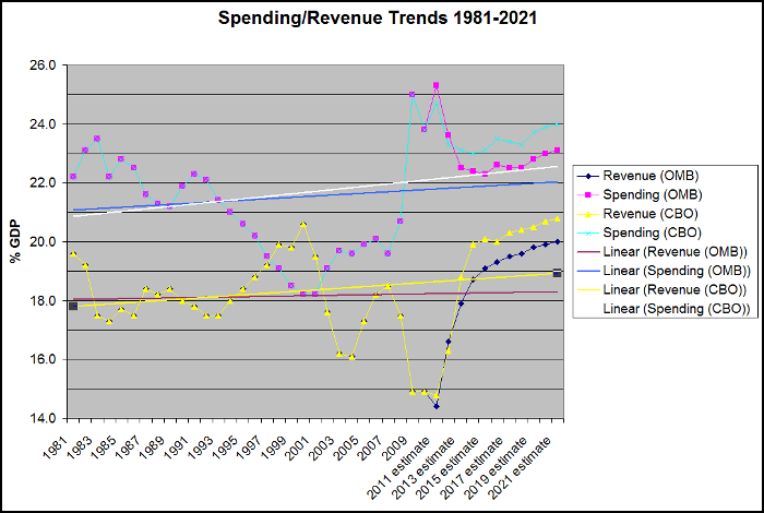
So I decided to take Drum at face value, and use the President (via OMB) & Congress’ (via CBO) projections of spending and revenue over the next 10 years, keeping Drum’s 1981 start date, to see how those trend lines line up. After all, if we’re going to criticize Obama’s spending and taxation, we should probably criticize the spending and taxation that this President and this Congress are authorizing, not the past.
Here are the trends:
As you can see, 1981-2010 revenue & spending is identical, but the projections diverge somewhat.
- The CBO projections MUST assume that all current law executes without change. As I pointed out previously, this assumes that ALL of the Bush tax cuts expire, ALL of the temporary stimulus spending expires, and actually assumes that discretionary spending tracks inflation, which is lower than historically occurs. Thus, they’re not only assuming that the tax cuts “for the rich” expire, they’re assuming ALL the Bush tax cuts expire, as is currently slated by law to occur.
- The OMB budget assumes both lower spending and lower revenues than the CBO, but I haven’t looked in detail to see how they’re getting there. I generally trust the OMB less than the CBO, but I wanted to provide both sets of numbers as the OMB is essentially the number based upon Obama’s policy.
- In both cases, defense spending as a percentage of GDP drops significantly over the course of the decade, as wars in Iraq and Afghanistan wind down. Thus, the spending impact of defense is not driving this spending jump. However, nondiscretionary spending in the Medicare/Medicaid & Social Security ARE big drivers of that spending jump.
That said, you can see in both cases that the trendline for revenues is up, and the trendline for spending is up, BOTH based upon the start date of 1981, which — deliberately or not — skews the numbers to higher start points for both revenue and spending. And you can see in both cases that the slope of the spending line rises faster than the slope of the revenue line. This is true even in the CBO projection, which fully ends the Bush tax cuts in 2012.
What does it mean if you completely end the Bush tax cuts and quickly wind down the cost of Bush’s wars, and spending STILL rises faster than revenues? Sounds like a spending problem to me…
As I said before, I don’t think Kevin Drum is being deliberately manipulative with these numbers. To believe that, I would have to give him credit for understanding these numbers. Instead, I believe he’s an innumerate hack. I’d ask myself why he continues to be paid, but judging by the grunting matches in his comment section between tribes of Republican and Democrat apes, it appears that there’s a market for his particular brand of mindless drivel.


